Mobile App Design
Designing a Simpler, More Accessible Banking Experience

During a three-day design sprint, I redesigned the payment creation flow in the Banca Intesa mobile app. The idea for this project came from a real problem:
my mother often struggled to create new payments in the app so my goal was to simplify this process so that users like her can complete payments easily and confidently.
Role
UX/UI Designer
Timeline
29 Oct 2025 - 1 Dec 2025
Skills
End-to-end design
User Research
Design Systems
Prototyping
Usability Testing
Step 1
Research
User Research
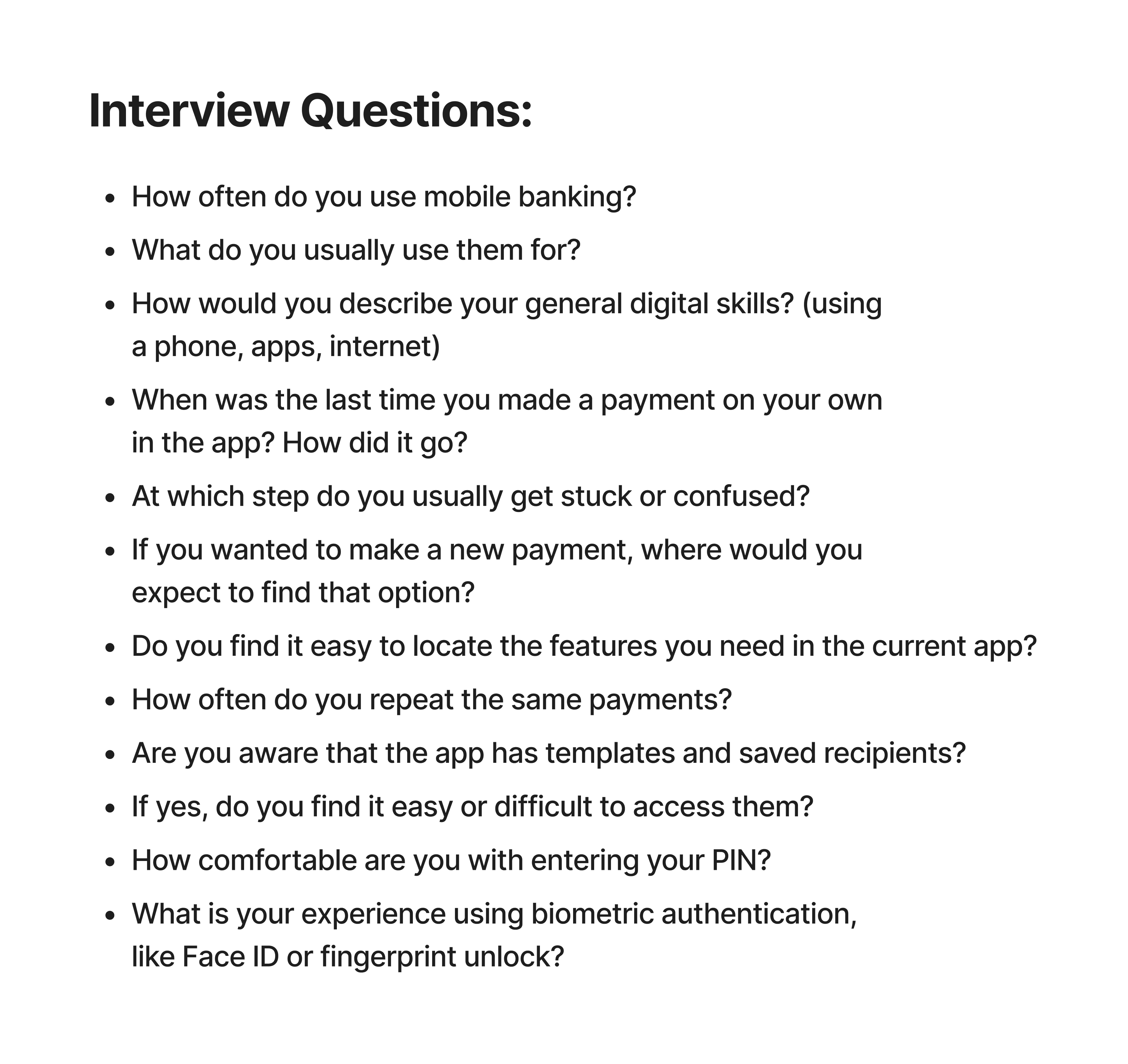
The first step was to get a clear and realistic understanding of the problem from the user’s perspective. To do that, I focused on older users (50+ years old) with average digital literacy, since this group was the most affected by the current payment flow. I conducted four in-depth interviews with participants who matched this profile and asked them to walk me through how they normally use the app, what they struggle with, and how they feel during the process.
The first step was to get a clear and realistic understanding of the problem from the user’s perspective. To do that, I focused on older users (50+ years old) with average digital literacy, since this group was the most affected by the current payment flow. I conducted four in-depth interviews with participants who matched this profile and asked them to walk me through how they normally use the app, what they struggle with, and how they feel during the process.

Competitive Analysis
To better understand industry standards, I analyzed two competing mobile banking apps - Erste Bank and Raiffeisen Bank, the only two apps I could access as an active client.
To better understand industry standards, I analyzed two competing mobile banking apps - Erste Bank and Raiffeisen Bank, the only two apps I could access as an active client.
Both apps showed clearer navigation, simpler payment flows, and modern features like biometric authentication. These insights helped me define the opportunities for improvement.
Both apps showed clearer navigation, simpler payment flows, and modern features like biometric authentication. These insights helped me define the opportunities for improvement.

Step 2
Defining
Identifying Key Problems
Based on the insights gathered from user interviews, competitive analysis, and a detailed review of the existing app, I identified four major problem areas that consistently affected the user experience. These issues appeared across all participants, especially those with lower digital confidence, and were strong indicators of where the app was failing to support their needs.
Based on the insights gathered from user interviews, competitive analysis, and a detailed review of the existing app, I identified four major problem areas that consistently affected the user experience. These issues appeared across all participants, especially those with lower digital confidence, and were strong indicators of where the app was failing to support their needs.

Step 3
Design Improvements
Redesigning Navigation
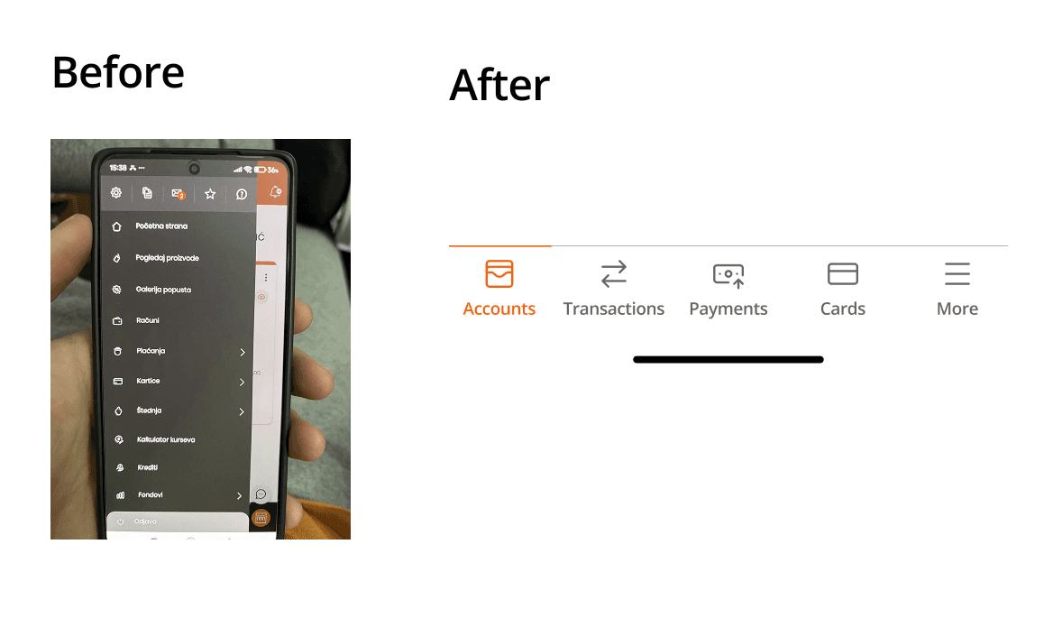
The main navigation problem was the oversized hamburger menu containing too many items. Users couldn’t easily distinguish important features from secondary ones, which caused confusion. This made it difficult for them to understand where to find the actions they needed most often.
The main navigation problem was the oversized hamburger menu containing too many items. Users couldn’t easily distinguish important features from secondary ones, which caused confusion. This made it difficult for them to understand where to find the actions they needed most often.
For users with lower digital confidence, this type of navigation added a significant cognitive burden. Instead of supporting quick decision-making, the menu forced them to scan through a long list of unrelated options every time they wanted to perform a simple task. As a result, users felt overwhelmed and unsure which path to take, which ultimately slowed them down and reduced their overall confidence in using the app.
For users with lower digital confidence, this type of navigation added a significant cognitive burden. Instead of supporting quick decision-making, the menu forced them to scan through a long list of unrelated options every time they wanted to perform a simple task. As a result, users felt overwhelmed and unsure which path to take, which ultimately slowed them down and reduced their overall confidence in using the app.
To solve this, I designed simple bottom navigation bar containing 4 key tabs for most important app features and more tab for all additional features. This structure gives users constant, one-tap access to the core features of the app, without forcing them to open a large menu or search through long lists of options.
To solve this, I designed simple bottom navigation bar containing 4 key tabs for most important app features and more tab for all additional features. This structure gives users constant, one-tap access to the core features of the app, without forcing them to open a large menu or search through long lists of options.
Adding a New Payment Action to the Home Screen
Most interviewed users said they had trouble finding the option to create a new payment. In the old version, users had to go through three steps just to reach it, which is far too many for such a critical action.
Most interviewed users said they had trouble finding the option to create a new payment. In the old version, users had to go through three steps just to reach it, which is far too many for such a critical action.
I redesigned the home screen to include a clear, visible “New Payment” button. This approach follows common patterns used by competitor banking apps, making it familiar and intuitive.
I redesigned the home screen to include a clear, visible “New Payment” button. This approach follows common patterns used by competitor banking apps, making it familiar and intuitive.

Improving the Payment Flow
A second major issue I noticed in 3 out of 4 interview participants was that they either didn’t know the app offered payment templates and saved recipients, or they knew these features existed but had no idea how to access them. In the current version of the app, both of these functionalities are hidden in the background and can only be reached from the payment creation screen through a small, visually understated button that most users simply overlook.
A second major issue I noticed in 3 out of 4 interview participants was that they either didn’t know the app offered payment templates and saved recipients, or they knew these features existed but had no idea how to access them. In the current version of the app, both of these functionalities are hidden in the background and can only be reached from the payment creation screen through a small, visually understated button that most users simply overlook.
This is a significant problem because all four participants mentioned that they repeat the same payments very often, and that having easy access to templates would save them a lot of time and effort. The fact that such a helpful feature is hard to find makes the overall payment process unnecessarily slow and more complicated than it needs to be.
This is a significant problem because all four participants mentioned that they repeat the same payments very often, and that having easy access to templates would save them a lot of time and effort. The fact that such a helpful feature is hard to find makes the overall payment process unnecessarily slow and more complicated than it needs to be.
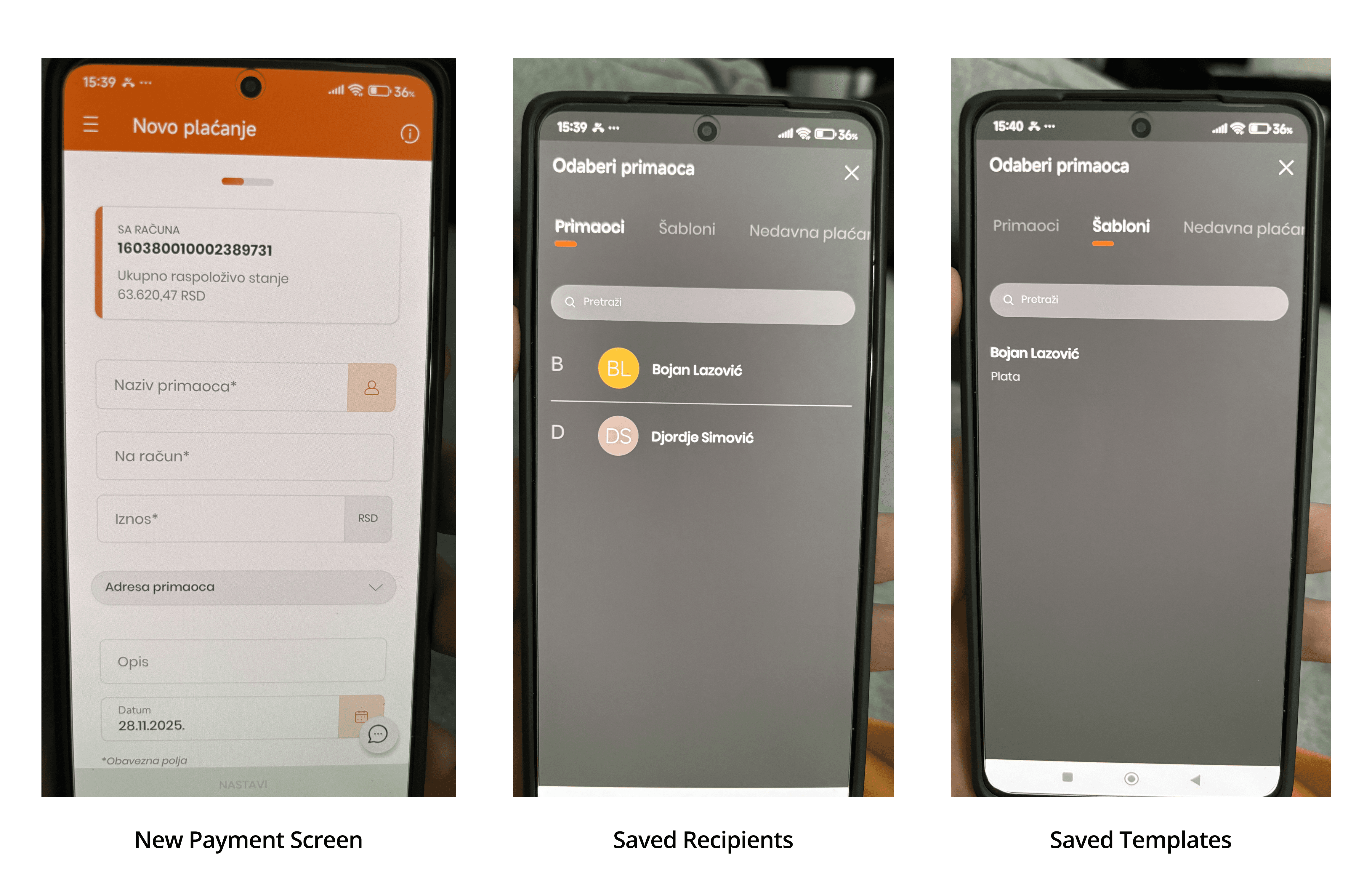
To solve this problem, I decided to completely reorganize the structure of the payment flow.
Instead of sending users straight to the form for entering payment details after tapping the New Payment button on the home screen, the redesigned flow first presents three helpful options:
choose a saved template
pick a saved recipient
repeat one of their previous payments
This approach brings the most useful actions to the forefront and makes them easy to access. By giving users direct visibility of the tools they rely on most, the app allows them to complete payments faster and with far less effort, ultimately creating a much smoother and more intuitive experience.
This approach brings the most useful actions to the forefront and makes them easy to access. By giving users direct visibility of the tools they rely on most, the app allows them to complete payments faster and with far less effort, ultimately creating a much smoother and more intuitive experience.

Adding Biometric Confirmation
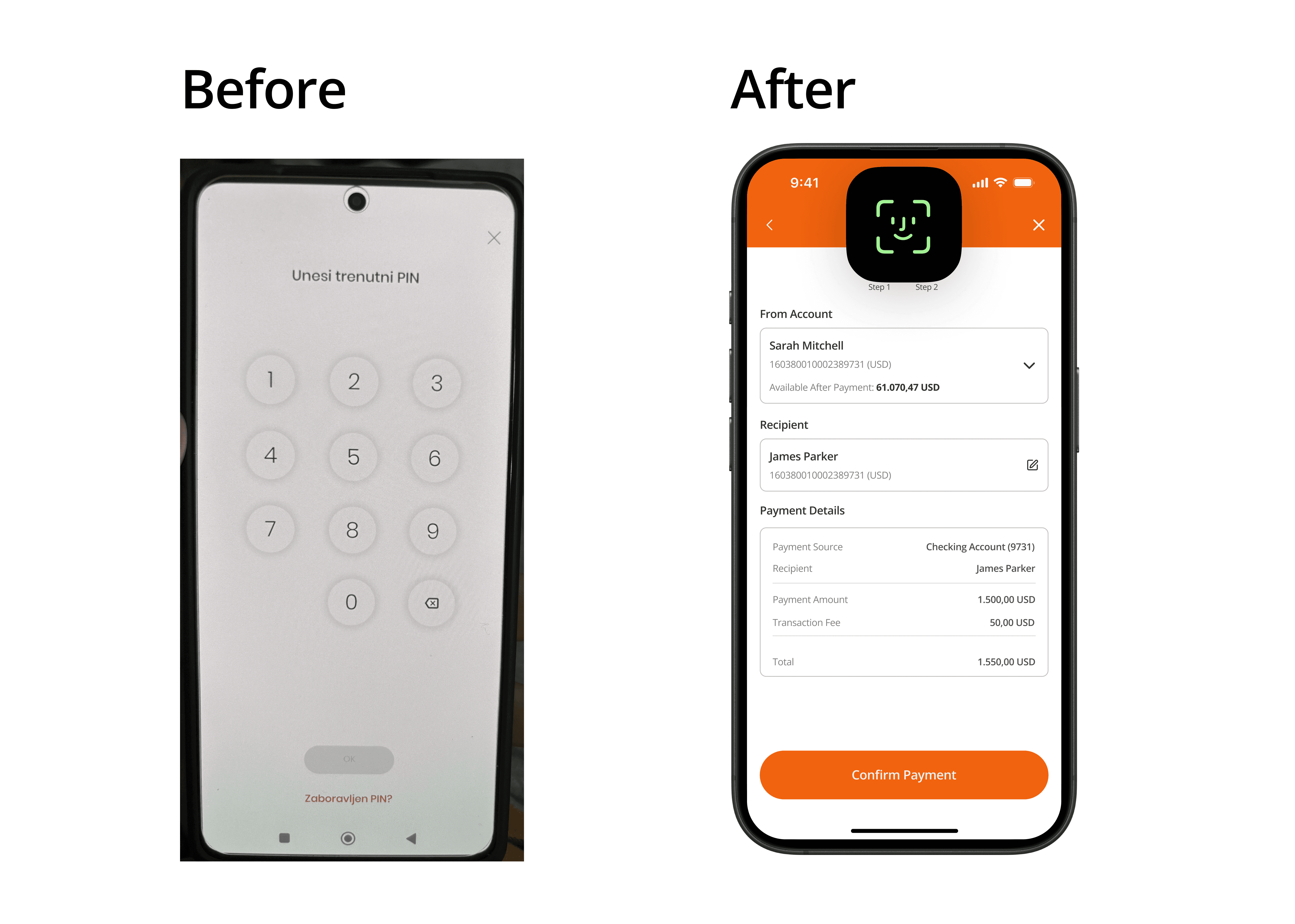
The original app didn’t support biometric authentication. Users had to enter a 6-digit PIN every time, many often forgot it, which caused frustration and delay.
The original app didn’t support biometric authentication. Users had to enter a 6-digit PIN every time, many often forgot it, which caused frustration and delay.
Since all participants said they already use Face ID or fingerprint unlock on their phones, I introduced biometric confirmation for both login and payment approvals. This makes the experience faster, safer, and much more convenient.
Since all participants said they already use Face ID or fingerprint unlock on their phones, I introduced biometric confirmation for both login and payment approvals. This makes the experience faster, safer, and much more convenient.
Step 4
Usability Testing
Testing the Redesigned Payment Experience
After completing the high-fidelity prototype, I conducted usability testing with the same four participants from the initial interview phase. The goal was to observe how easily they could navigate the redesigned flow and whether the changes actually solved the problems identified during research.
After completing the high-fidelity prototype, I conducted usability testing with the same four participants from the initial interview phase. The goal was to observe how easily they could navigate the redesigned flow and whether the changes actually solved the problems identified during research.
Each participant was given the same five tasks representing the most common real-world actions inside the app:
Create a new payment from scratch
Create a payment using a saved template
Create a payment using a saved recipient
Create a new payment template
Add a new recipient to the saved list
Each participant was given the same five tasks representing the most common real-world actions inside the app:
Create a new payment from scratch
Create a payment using a saved template
Create a payment using a saved recipient
Create a new payment template
Add a new recipient to the saved list
These tasks were chosen because they cover the full range of actions users perform in everyday banking and directly relate to the core problems discovered earlier.
These tasks were chosen because they cover the full range of actions users perform in everyday banking and directly relate to the core problems discovered earlier.
Results
The outcome of the usability testing was very positive:
All four users successfully completed all five tasks
No errors, no hesitations, and no moments of confusion
Every participant described the new flow as much simpler, clearer, and more intuitive
Users said they would now feel comfortable making payments independently, without needing assistance
These results clearly showed that the redesign effectively addressed the original issues and significantly improved the overall experience of creating payments within the app.
These results clearly showed that the redesign effectively addressed the original issues and significantly improved the overall experience of creating payments within the app.
Step 5
Conclusion
What I Learned
This project reminded me how important it is to question your assumptions and look at the product from the user’s perspective, not your own. Understanding how people think, what they expect, and what feels natural to them is key. I also learned how much emotions influence the experience - people remember how an app makes them feel. Keeping all of this in mind helps create solutions that are functional and genuinely easy to use.
This project reminded me how important it is to question your assumptions and look at the product from the user’s perspective, not your own. Understanding how people think, what they expect, and what feels natural to them is key. I also learned how much emotions influence the experience - people remember how an app makes them feel. Keeping all of this in mind helps create solutions that are functional and genuinely easy to use.